
Introduction to Calming Color Schemes
The Psychological Impact of Color
Colors have a profound psychological impact on our emotions and behaviors. The hues that surround us can influence our mood, energy levels, and even our appetite. For instance, warm colors such as reds and oranges are known to stimulate and energize, while cool colors like blues and greens tend to be soothing and calming. This understanding is crucial when selecting a color palette for your home, as the right choice can create a haven of tranquility.
Understanding Color Theory
Color theory is a body of practical guidance to color mixing and the visual effects of specific color combinations. It encompasses a multitude of definitions, concepts, and design applications, including the color wheel and the relationships between colors. Comprehending color theory is essential for creating a cohesive and aesthetically pleasing color scheme in your home. It helps in understanding how different colors interact, the significance of color temperatures, and how colors can be mixed to achieve the desired effect.
Benefits of Calming Colors in Home Environments
Incorporating calming colors into home environments can have several benefits. These hues can help reduce stress and anxiety, promote relaxation, and enhance sleep quality. Calming colors can also create a sense of spaciousness and cleanliness, making your home feel more open and inviting. By choosing a calming color scheme, you can transform your living space into a sanctuary that supports your well-being and provides a peaceful retreat from the outside world.
Identifying Your Personal Color Preferences
While understanding color theory and the psychological impact of colors is important, it’s equally crucial to identify your personal color preferences. Your home should reflect your personality and style. Start by observing the colors that you are naturally drawn to and consider how they make you feel. Do certain colors evoke memories or emotions? Do they align with the atmosphere you wish to create in your home? Experiment with different shades and undertones to discover what resonates with you. Remember, neutrals are colors too, and they can serve as a foundation for your color scheme, allowing you to layer with more vibrant hues to achieve balance and harmony.
Ultimately, the colors you choose for your home should be ones that you love and that contribute to a calming and harmonious environment. Trust your instincts and don’t be afraid to mix and match until you find the perfect palette that feels like home.
Setting the Tone with Neutrals
The Power of White and Off-White
White and off-white shades are the quintessence of neutrality, offering a canvas that is both pure and versatile. Designer Elaine Griffin describes painting a room white as “giving it a big, tall glass of water.” This cleansing effect allows for a refreshing start, where decor and furniture can truly shine. White’s power lies in its ability to make spaces appear larger and brighter, while off-white introduces a subtle warmth, preventing the starkness often associated with pure white.
Incorporating Grays for Sophistication
Gray is the chameleon of neutrals, adept at adding a sophisticated flair to any space. With its spectrum ranging from cool to warm tones, gray can evoke different emotions and atmospheres. Designer Vicente Wolf suggests choosing a shade based on the desired mood, whether airy or earthbound. Warm grays, with their beige undertones, can create a cozy ambiance, while cool grays lend a more modern, sleek look. The key is to select the right intensity and nuance to complement your decor and achieve the desired level of sophistication.
Using Beige and Earth Tones for Warmth
Beige and earth tones are the go-to hues for instilling warmth into a home. These colors draw inspiration from nature, bringing the outside in and creating a nurturing and inviting environment. Designer Mary McGee compares the perfect beige to a creamy latte, suggesting a mix of specific paint colors to achieve a rich, warm hue. Earth tones, like terracotta and sand, can also add depth and a sense of stability to a room.
Combining Neutrals for Layered Complexity
Layering different neutrals can result in a rich tapestry of textures and shades that add complexity and interest to a space. This technique involves blending various neutral tones, such as cream, dove gray, and taupe, to fashion serene color schemes that shift with the changing light. The interplay of these shades can create a dynamic yet harmonious look, especially when combined with a variety of finishes and textures, from high gloss to woven fabrics. By carefully selecting and combining neutrals, you can achieve a sophisticated and nuanced palette that exudes calmness and elegance.
Cool Hues for a Tranquil Atmosphere
The Serenity of Blues
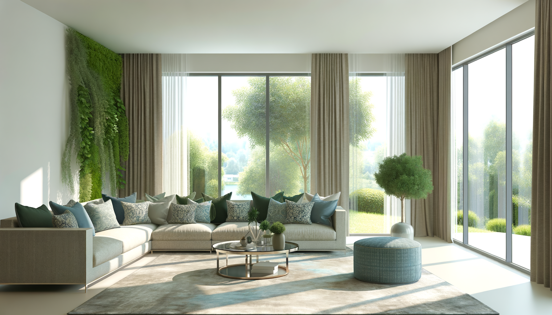
Blue hues are synonymous with tranquility and calmness, often reminiscent of the soothing qualities of the sky and sea. Incorporating shades of blue into your home can create a serene sanctuary. Lighter blues like pale aqua or silvery sky-blue can expand a space and invite a peaceful ambiance. Deeper blues, while still calming, add a touch of sophistication and depth to a room. To maximize the serenity of blues, consider pairing them with soft textures and subtle patterns in your decor.
Refreshing Spaces with Greens
Green, the color of nature, has a refreshing and renewing effect. Sage, a muted green, brings a sense of harmony and balance to any space. It works exceptionally well in areas where you seek rejuvenation, such as bathrooms and bedrooms. To enhance the natural feel, complement greens with organic materials like wood or bamboo, and don’t shy away from adding a variety of indoor plants to truly bring the outdoors in.
The Calm of Lavender and Soft Purples
Lavender and soft purples are often associated with luxury and creativity, but they also have a calming effect that can transform a room into a peaceful retreat. These hues are perfect for areas of rest or meditation. When using lavender, balance it with neutral tones and natural textures to maintain a soothing atmosphere without overwhelming the senses.
Balancing Cool Tones with Warm Accents
While cool tones are calming, adding warm accents can create a more dynamic and inviting space. Consider incorporating elements like woodgrain, a leather-bound book, or a terracotta pot to bring warmth into a cool-colored room. These accents can be subtle, such as a throw pillow or a piece of art, ensuring the overall calming effect of the cool hues is not lost.
By thoughtfully integrating these cool hues into your home, you can create a tranquil atmosphere that promotes relaxation and well-being. Remember to consider the lighting in your space, as it can significantly affect how these colors are perceived. Soft, natural light will enhance the calming effect of these cool tones, making your home a soothing oasis.
Warm Colors for a Cozy Vibe
Soft Pinks and Rosy Hues
Soft pinks and rosy hues are the epitome of a cozy and nurturing atmosphere. These gentle colors evoke feelings of compassion and warmth, making them perfect for creating a comforting space. Using a rosy color palette can transform a room into a gracious setting, as seen in bar nooks or bedrooms where deep blush walls instill warmth and intimacy. To enhance the coziness, consider pairing these hues with plush textures and vintage decor for a romantic and inviting ambiance.
Muted Yellows for Subtle Sunshine
Muted yellows, like a soft buttery tone, bring a subtle sunshine into your home, offering a cheerful backdrop without overwhelming the senses. This color represents happiness and optimism, illuminating rooms and lifting spirits. Integrating muted yellows through wall paint or accent pieces can brighten up a space while maintaining a relaxed atmosphere. Pair these sunny shades with crisp whites or soft neutrals to create a balanced and inviting environment.
Earthy Reds and Oranges
Earthy reds and oranges are warm and inviting, perfect for creating a space that encourages conversation and togetherness. These colors are known for their stimulating and vibrant qualities, which can add energy to a room. Incorporating rich terracotta or a splash of peach through accent walls, throw pillows, or area rugs can infuse your home with a sense of creativity and enthusiasm. When used in moderation, these warm tones can make a room feel more intimate and cozy.
Blending Warm Colors with Neutrals
Blending warm colors with neutrals is a sophisticated way to create a cozy yet modern space. Neutrals like beige, taupe, and ivory provide a warm backdrop that complements the vibrancy of warm colors. This combination allows for a layered complexity in your decor, where the warmth of reds, oranges, and yellows can be grounded by the subtlety of neutral tones. For instance, a rustic wood coffee table or a beige upholstered bed can serve as a neutral base, while decorative accents in warm colors add character and coziness to the room.
In conclusion, warm colors are a powerful tool in transforming your home into a cozy haven. From the softness of pinks to the brightness of yellows and the earthiness of reds and oranges, these hues can create a welcoming and intimate space. When blended with neutrals, they offer a sophisticated and layered look that invites relaxation and comfort. Embrace these warm color schemes to craft a home environment that exudes coziness and warmth.
Creating Harmony with Color Combinations
Complementary Color Schemes
Complementary color schemes are a classic approach to creating visual interest and dynamic contrast in your home. By pairing colors that are opposite each other on the color wheel, such as blue and orange or purple and yellow, you can achieve a vibrant look that pops. This scheme is particularly effective for accentuating focal points or for adding a burst of energy to a space. However, to maintain a calming atmosphere, it’s important to use complementary colors in a balanced way, often by choosing one color to dominate and the other to accent.
Analogous Color Schemes
Analogous color schemes offer a more harmonious and serene look by using colors that are next to each other on the color wheel. This could include a combination of cool blues and greens or warm reds and oranges. These colors usually blend well together, creating a soothing and cohesive look. To add depth and interest to an analogous color scheme, incorporate various shades, tints, and tones of the chosen colors. This approach is ideal for creating a restful environment in areas like bedrooms or bathrooms.
Monochromatic Color Schemes
For a sophisticated and unified aesthetic, monochromatic color schemes are the way to go. This scheme involves using different shades, tones, and tints of a single color. It’s a simple yet effective way to create a cohesive look that can range from subtle and soft to bold and dramatic, depending on the chosen hue. Monochromatic schemes are also incredibly versatile, allowing for a variety of textures and materials to add richness and dimension without disrupting the color harmony.
Triadic Color Schemes
Triadic color schemes are vibrant and lively, using three colors that are evenly spaced around the color wheel. This could include a trio like red, yellow, and blue, which provides a bold and balanced palette with plenty of contrast. To keep the tranquility in your home, it’s best to choose one dominant color and use the other two as accents. This approach ensures that the colors enhance rather than compete with each other, creating a dynamic yet harmonious space.
When implementing these color schemes, consider the mood you want to evoke in each room, the balance of colors, and the overall flow of your home. Whether you’re looking for a peaceful retreat or an energizing space, the right combination of colors can transform your home into a haven of harmony and calm.
Practical Tips for Implementing Your Color Scheme
Choosing the Right Paint and Finishes
When selecting paint, consider the mood you want to evoke in each room. For a calming effect, opt for pale hues and soft finishes. Matte or eggshell finishes can soften a space, while a satin finish may add a subtle glow. Test paint samples on your walls and observe them at different times of the day, as lighting can significantly alter the appearance of color. Remember, the right finish can enhance the soothing qualities of your chosen color scheme.
Selecting Fabrics and Textiles
Fabrics and textiles add texture and depth to your calming color palette. Choose materials that complement your color choices, such as linen or cotton in neutral tones for a serene setting. For a touch of elegance, consider silk or velvet in muted shades. Patterns should be subtle and cohesive with the overall color scheme to maintain a tranquil atmosphere.
Incorporating Decorative Elements
Decorative elements like cushions, throws, and artwork are opportunities to introduce accent colors from your palette. These should harmonize with the room’s primary colors and contribute to the desired ambiance. For instance, a soft blue throw pillow can enhance the tranquility of a beige living room. Keep decorative items balanced and avoid clutter to preserve a sense of calm.
Lighting and Its Effect on Colors
Lighting can dramatically affect how colors are perceived. Natural light brings out the truest hue, while artificial lighting can alter it. Consider the color temperature of your light bulbs; warm white bulbs enhance warm tones, whereas cool white bulbs complement cool tones. Use dimmers to adjust the intensity and mood of the room throughout the day.
Maintaining Balance and Flow Throughout the Home
To achieve a cohesive look, ensure your color scheme flows naturally from room to room. This doesn’t mean every room should be the same color, but rather that they should connect through shared hues or accents. Use the 60-30-10 rule as a guideline: 60% of the room should feature the dominant color, 30% a secondary color, and 10% an accent color. This balance will create a harmonious transition throughout your home.
Conclusion: Embracing Calmness Through Color
Review of Key Takeaways
In our exploration of calming color schemes for the home, we’ve delved into the profound psychological impact of color and its ability to shape our emotions and environment. We’ve understood that color theory is not just an artistic concept but a practical tool for creating a serene and harmonious living space. The benefits of calming colors in our homes are numerous, from fostering relaxation to enhancing well-being. We’ve also recognized the importance of identifying personal color preferences, as they are deeply connected to individual experiences and emotions.
Throughout this journey, we’ve seen how neutrals can set a soothing tone, how cool hues can create a tranquil atmosphere, and how warm colors can offer a cozy vibe. We’ve learned to create harmony with thoughtful color combinations and practical tips for implementing these schemes into our homes. Now, as we draw this exploration to a close, it’s time to reflect on these insights and consider how they can be applied to transform our own living spaces.
Encouragement to Experiment with Colors
While we’ve provided guidelines and suggestions, the true beauty of color lies in its infinite possibilities. I encourage you to experiment with different hues, shades, and combinations. Don’t be afraid to step outside your comfort zone and try something new. Whether it’s a bold accent wall or a subtle change in textiles, each modification is a step towards personalizing your space. Remember, the colors you choose should resonate with you and reflect your unique style and personality.
Consider starting small with decorative elements or a single room, and observe how the new colors affect your mood and the ambiance of the space. Use samples and swatches to test how colors interact with the lighting in your home and how they complement each other. This process is not just about aesthetics; it’s about creating an environment that brings you peace and happiness.
Final Thoughts on Personalizing Your Space
Your home is your sanctuary, a place where you can express yourself freely and retreat from the outside world. The colors you surround yourself with play a crucial role in ensuring that your home is a true reflection of what brings you calm and joy. As you embark on the journey of transforming your home with calming color schemes, remember that there are no strict rules to follow. What matters most is that the colors you choose speak to you, creating a space that soothes your soul and lifts your spirits.
Whether you prefer the soft embrace of pastel blues, the earthy touch of warm beiges, or the vibrant energy of muted yellows, let your intuition guide you. Embrace the transformative power of color, and allow it to infuse your home with the tranquility and comfort you deserve. In the end, the goal is to create a space that feels uniquely yours, one that harmonizes with your innermost desires and becomes a canvas for your life’s most cherished moments.